13. V–1. VII 2023
Tütar Gallery
When tasked with reviewing an artist’s latest solo exhibition, it’s natural to get oneself acquainted with the artist’s past work and persona. I met Katrin Piile at her studio in Põhjala Factory, where we discussed her solo exhibition, “In Search of Idyll”, at Tütar Gallery. We also talked about her path to becoming a painter and her past endeavours.
After our meeting, I realised how important it was to share the artist’s thoughts with the reader in full. This thought was further supported by my perception that Juhan Raud’s review of Wes Anderson’s recent film, “Asteroid City”1, in the cultural newspaper Sirp, could just as easily serve as my review of the exhibition. After attending Piile’s solo exhibition, I was compulsively drawn to see the film, which, judging from the poster and trailer, shares a remarkably similar colour palette with the exhibition. As I watched the film, I discovered other mutual motifs, some of them also mentioned in the film review: parallel plot-lines, peculiar characters whose encounters spark unique narratives, a focus on behind-the-scenes elements, captivating colours, aesthetic and stylish patterns, tastefully crafted scenes, intricate machinery and miscommunications that contribute to a sense of uncertainty.
With its pastel shades, Piile’s universe initially appears sweet, while the use of wallpaper motifs that stir up different associations and memories evokes a feeling of nostalgia. This world is characterised by immaculate precision, refined technical prowess and a serial format featuring recurring characters and motifs.
No doubt, the artist knows precisely what she is doing. So I asked her to tell us.
*
Regina Mets (RM): Opening a new gallery with an exhibition must be quite an honour and recognition for an artist, right?
Katrin Piile (KP): Absolutely, I consider myself fortunate. I only met Mailis Timm, the founder of Tütar Gallery, last November. We had a general discussion about potential collaboration. Then, early this year, she offered me the opportunity to hold an exhibition in the spring.
Given that I had recently held a joint exhibition with Art Allmägi at Rüki Gallery2 and that my upcoming exhibitions – one in September at Pärnu Art House and another at the end of November at Hobusepea Gallery in Tallinn – were also collaborative ventures with Art, I thought it would be refreshing to have a solo exhibition for a change. The balloon series displayed in “In Search of Idyll” had previously only been shown once at Draakon Gallery.3
RM: So, you’ve had quite a busy exhibition schedule lately?
KP: Indeed. Initially, I had reservations about having enough time to prepare the opening exhibition for Tütar Gallery. But I assured the gallerist that I was up for the challenge!
RM: Did you also feel a sense of responsibility? In the sense that the inaugural exhibition of a gallery, in a way, represents the gallery itself and can significantly shape its reception within the art community.
KP: Absolutely. While I initially intended to display my earlier works, I ended up creating numerous new pieces. I thought of presenting them within a studio-like context, weaving together disparate earlier series. An artist’s studio is where diverse works and series converge. For instance, some pieces exhibited at Rüki Gallery were merely stacked on the floor at Tütar Gallery. All in all, I strove to present my best efforts.
RM: You’ve been a trailblazer in various ways. For example, you were the first – and so far, the only – recipient of the Malle Leis Prize.4
KP: Yes, I’ve developed a growing appreciation for Malle Leis’ work over time. I find her serigraphs especially captivating! I hold a general admiration for her era – Kaarel Kurismaa (b. 1939) stands as a prime example in this context. Fifteen years ago, I thought of his works as relics of the past, while today his creations seem remarkably contemporary. A similar transformation took place with Malle Leis. At one point, her work seemed to be stuck in the past, but now – in the present – it resonates exceptionally well.
RM: How did your interaction with the audience at Tütar Gallery unfold? What do people ask the artist?
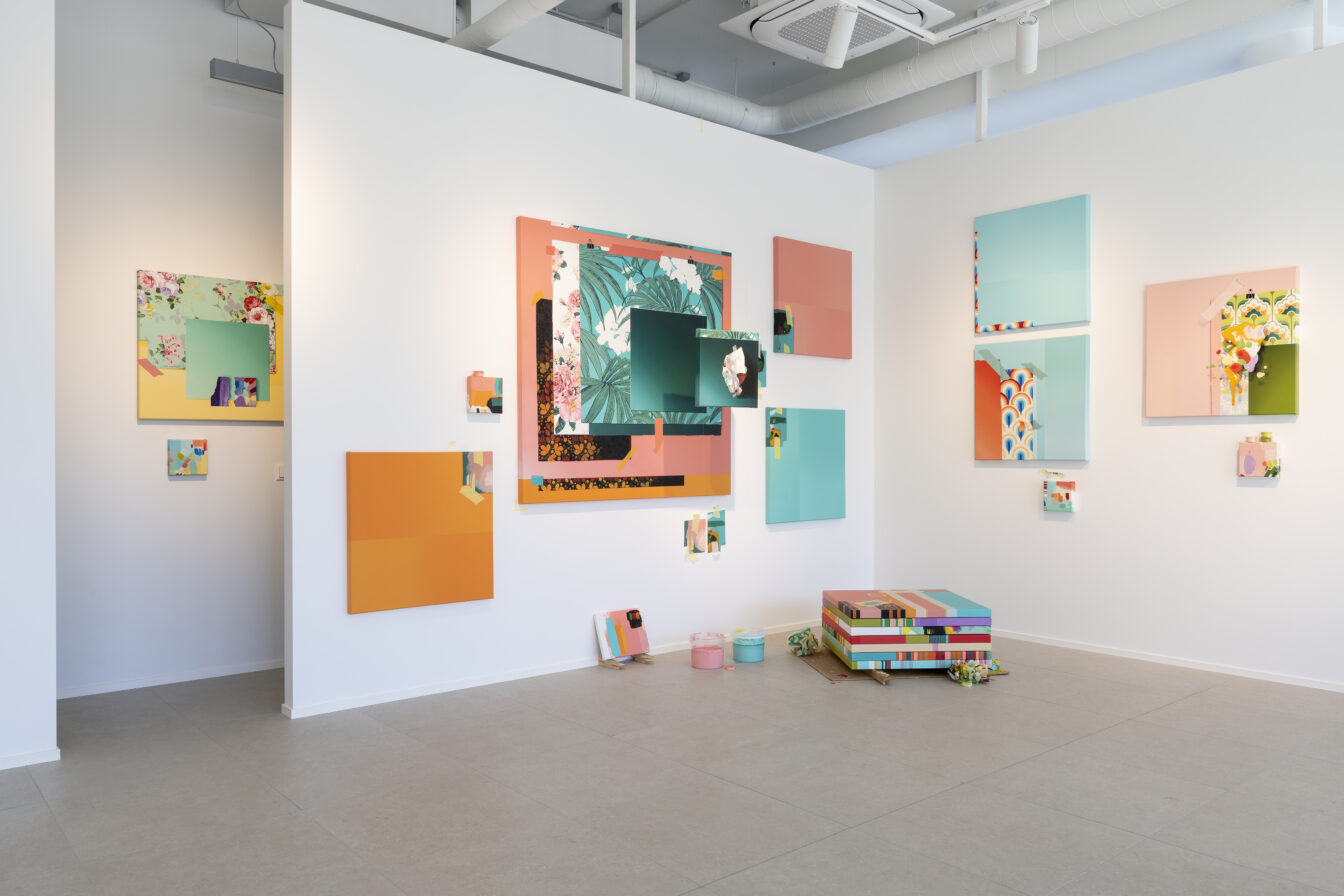
Exhibition view at
Tütar Gallery
Photo: Roman-Sten Tõnissoo
KP: People tend to ask me about my techniques and colour choices and the process by which I arrive at those combinations. I found it relatively straightforward to explain the concept, and there weren’t any questions about that – although it is possible that people from other areas just don’t know what to ask about this aspect of the work.
RM: Could you explain the concept behind the “In Search of Idyll” exhibition? It appears that you combined two different themes, two different exhibitions.
KP: Since I’ve produced two distinct series of paintings, I needed to mentally untangle and closely examine both bodies of work. In both cases, I used the classical photorealistic technique of portraying familiar objects. These two objects embellish our everyday lives – balloons during celebrations and wallpapers in our daily existence. I began exploring balloons during the pandemic. Alone in my studio, with the boiler leaking…
RM: The boiler was also leaking at your exhibition in Draakon Gallery!
KP: Precisely! I also had balloons in my studio, and over time, they began to fascinate me. I found them strangely intriguing – similar to a perverted object such as a silicone breast – with their contorted shapes, bondage motifs and eventual disintegration. All that remains is a knot – until even that vanishes. The theme of disappearance is frequently explored across my series.
My exhibition at Draakon Gallery was notable for including a diverse range of colours. And the response this elicited from the audience was very unexpected. It’s interesting how placing something in a pink frame can cause it to be overlooked in all other ways. Pink implies vibrancy and joy. Yet, my intent was to express tragedy within the pink exterior. The “rabbit series of drawings”, which was framed in pink, was meant to illustrate the turmoil within – how, during the pandemic, you could sit alone before, finally, you disappear.
RM: I had speculated that you might have drawn inspiration for the balloon theme from Laurentsius, with whom you shared an exhibition at Haus Gallery,5 where he exhibited hyper-realistic paintings featuring heart-shaped silver balloons.
KP: Not directly, but perhaps unconsciously.
Nevertheless, I did intentionally incorporate Laurentsius’ use of tape. Initially, my vision was to create abstract renditions of tape in stark contrast to Laurentsius’ realistic depictions. However, I was overcome by the urge to take the realistic route. Laurentsius encouraged me, saying, “Go for it – you will make it your own”.
RM: What made you want to paint tape?
KP: It creates a visual ambiguity of reality. At Rüki Gallery, all the tape was painted without any real tape being used. At Tütar Gallery, however, real tape was combined with the painted tape.
RM: Did you discover hyperrealism during your studies at the Estonian Academy of Arts? Who were your teachers?
KP: During my academic years (2006–2010), Kaido Ole was a professor, with Tõnis Saadoja as an associate professor. Laurentsius taught for one semester, and there were also other instructors like August Künnapu and Erki Kasemets.
But the concept of hyperrealism is not something I acquired from school; it has been with me since childhood. I never really drew from scratch. Instead, I started copying photos. As a shy child, I gravitated towards solitary activities. Presenting my work was a way to gain recognition without having to perform in front of others.
RM: Did you receive positive feedback back then?
KP: It was more along the lines of: “Oh, very nice! But look here, this part is off, and this.” Perhaps that’s where my insecurity of not being good enough stems from. I could just apply a layer of paint, and that would be enough. Yet, I feel the compulsion to keep going above and beyond, striving for perfection.
What usually forces me to finish a piece is the deadline. Otherwise, I’d never complete it. Selling the pieces is beneficial; otherwise, I’d be constantly tweaking and repainting them.
RM: Given its practicality, did the idea of hyper-realistic pen drawings also originate from your childhood?
KP: The ballpoint pen came into play around my university years. I used regular pencils before, but they didn’t feel right. So I went to an office supply store, bought their whole range of pens, and began experimenting to find the best fit. I found that the cheapest options (Schneider and Bic) were the ones I liked best. Drawing takes considerably longer than painting, and I like that there’s no room for mistakes. Every line you put down leaves a mark.
RM: Do you keep track of the time you spend on your work?
KP: I began measuring the time when a significant life change occurred, and I quit my job overnight. Up until 2015, I had a day job. After my studies at the academy, I dedicated another year to art, but then I went back to paid work for survival. I worked at Tallinn airport’s cigar shop for eight months and then as an aerographer for several years. Among other tasks, I painted motorsports helmets, including the trophy helmets for Rally Estonia. But I wasn’t happy and missed painting.
However, I couldn’t paint while working. I greatly admire artists who can balance work and exhibitions, but my paintings take time. It’s like a full-time job and then some.
But when my partner (Remo Randver, pseudonym Ig Noir. – Ed.) passed away in 2014, I began contemplating life differently. The fears of needing a job, health insurance and security disappeared. I questioned why I worked at a job I didn’t enjoy. And then, I slowly began painting again.
Technically, I didn’t feel like I had mastered painting yet – I lacked confidence. And then, I started painting my palette. Although the palette is very small, my oil painting “Illusion” (2016–2018), which measures 140 x 140 cm, only covers one corner. The photo of the palette had such a high resolution that I could enlarge it significantly to see all the details. I spent over two years intermittently working on this painting, experiencing varying degrees of success. This process ultimately transformed me into a skilled painter and gave me a sense of confidence. I realised that, if given enough time, I could paint any photo placed in front of me.
However, I eventually lost interest in photorealism, leading me to explore in different directions.
RM: With this painting, you’ve secured your place in Estonian art history – the newest high school art history textbook6 features you as a notable hyperrealist painter alongside your teachers Saadoja and Laurentsius!
But please, tell us what made you paint wallpaper patterns.
KP: The wallpaper motif came to me in 2020 as I was planning the largest painting in the “In Search of Idyll” exhibition (“An Idyll No 1”, 2021–2022). This painting was initially intended for the Estonian Painters Association’s “Park and City” exhibition at Kadriorg Plaza Gallery in the spring of 2021. During this time, I started contemplating the idea of a park. I realised that a park is nature arranged into order, and that sparked the idea of taking an element from nature and infusing it with rhythm. The intrinsically naïve pattern on wallpaper gains significance through repetition. A single strawberry on wallpaper has no effect, but with repetition, it begins to create an impact.
However, I didn’t manage to submit the painting for the exhibition because it took longer to complete than I had anticipated. It was the first time I had experimented with acrylic paints, and I soon realised that they weren’t as quick to work with due to the need for multiple layers.
The crumpled painting (“An Idyll No 0”, 2022–2023) that emerged as an installation was born at a later time. It’s essentially “An Idyll No 1” but in crumpled form. I printed it, crumpled the paper, took a photograph and then painted what I saw.
RM: I wouldn’t have immediately recognised the crumpled paper as the original painting! Now that you’ve pointed them out, I can see the similarities.
KP: The problem is that I expect people to grasp the concept immediately. That’s why I placed the white side of the paper facing outward.
RM: Often, exhibition visitors don’t delve as deeply into the concept as the artist might expect. Frequently, the “average” viewer doesn’t even engage with the exhibition on an intellectual level.
KP: I got the idea of crumpling paper from the British conceptual artist Martin Creed, who crumpled a white A4 sheet into a small ball in 1995. I saw a documentary about him where he didn’t discuss the content of the artwork but rather talked about the physical difficulty of creating it. Initially, I wanted to make a ball like that myself, but I found it too challenging. I couldn’t make it happen! When I saw photos of his beautifully executed work, however, I wanted to explore this theme further. So I stole the idea of crumpling paper from him.
RM: In the “In Search of Idyll” exhibition, you also introduced the theme of “references”, as indicated in some of the small canvases’ titles.
KP: These “references” are essentially colour palettes – abstract, freehand representations – that were never intended for display. They were practical necessities that I used to test the shades of acrylic paint, which darkened as they dried. With the frames in place, however, they seemed to fit this particular composition.
I think of them as “references” because while the paintings in the “idyll series” can exist as standalone works, these references cannot. Similar to a book, references and notes cannot be separated from the main text.
RM: Where did the title “In Search of Idyll” come from?
KP: Coming up with the title was always the most challenging part. As I delved more into the wallpaper paintings, I began to see them as still lifes – where nothing is happening but the interplay of light and shadow. But I realised that I couldn’t use still lifes as the title. I typed “still life” into the Estonian dictionary online, and the first result that came up was “idyll”. This was a surprising discovery for me.
RM: And what about the shift towards a more colourful palette?
KP: The transition to more vibrant colours began with the “rabbit series” in 2020, which I initially planned to frame in black. It consists of 20 works. During that time, however, I was also working on creating a website and had all my work in a single folder. It was then that I noticed that the dominant tone of my work was black. I thought maybe I should explore using something different for a change. What’s the complete opposite of black? Pink! I’m not particularly fond of pink, but I realised it served as a counterbalance to the black.
Although the rabbit was initially created using a red pen – I only switched to a pink one later.
RM: Is that when you started keeping track of time?
KP: Not exactly. When I became a freelancer, I realised that after spending 12 hours in the studio, I had only worked for four hours. So I began setting a goal of eight hours a day to make meaningful progress.
Since I paint and draw while sitting or in a fixed position, it takes a toll on my body. Now, I take five-minute breaks every hour with a skipping rope. I developed this habit in my previous studio. It helps me contemplate the painting and think about adjustments while doing physical activity.
Of course, as the exhibition date draws near, discipline becomes less of an issue. During that period, I work continuously. My meal times are also more or less fixed to ensure I have energy until the evening.
RM: Your current works are quite colourful, and that’s what stands out initially. How would you describe the colour palette?
KP: I do use acrylics, but I don’t apply them straight from the tube. I often mix them with white primer and water, resulting in more pastel shades. In Tütar Gallery, you might have noticed the small cups that I use to mix each of these colours separately. After that, I test and adjust the mix before applying it to the painting.
RM: You also had a notable period with the Non Grata collective and the Metropol Gallery. How did you become involved with them?
KP: In high school, my drawing and painting teacher was Erik Alalooga. After I graduated, he invited me to a welding workshop conducted by Non Grata in Pärnu. That’s where I got to know them, and it was an eye-opening experience for me – everyone was eccentric, everyone was free to express themselves, and you could be anything you wanted! It was a time of youthful wildness. I worked with them for two years, participating in performances and travelling to New York and Germany.
But I reached a point where I felt I was done with performances. During my university years, I lived at the Polymer culture factory. From there, I moved to the Metropol Gallery, where I stayed for ten years. In 2019, I moved to Põhjala Factory.
My time at Metropol was both interesting and eccentric – it was like a madhouse, but I was totally absorbed in it. We lived in Kalamaja, which was like a small village, as initially, there were still no new buildings around. Metropol was situated on a hilltop, almost like a castle! There was a burned-down wooden house next door, and through its courtyard, you could walk to the seafront to enjoy your cup of morning coffee. Yet all the amenities of the city were within reach. It was a fantastic place. At least to begin with!
Although the area has developed rapidly in recent times, Metropol has remained unchanged. Things have carried on much the same way as they did during my time there. I make a few visits each year and bring new people along. Seeing the place never fails to surprise them. By the end of my time there, I found myself handling financial matters and other practical issues. For instance, there was a new gas cooker sitting in the corner of the kitchen for five years, unpacked and waiting to be installed. I became increasingly frustrated with these issues, even though I’m surprisingly tolerant and can get along with anyone.
I still appreciate the contrast you find at Metropol. In 2018, I met Art Allmägi during his exhibition at the gallery. He had already met some of the older gentlemen at Metropol. When I arrived at my studio, he was quite surprised to see a young woman around. As we got acquainted, I showed him my recent work – those hyper-realistic paintings of the artist’s palette. He couldn’t contain his surprise at seeing “someone in this house paint like this” and “someone here as meticulous as this”. This contrast works particularly well in Metropol. The Põhjala studio tends to be overly organised and tidy in comparison.
RM: I assumed that your artistic style shifted after you transitioned to a new studio.
KP: I want to avoid becoming stuck in a single artistic approach. I’ve already been asked before if I plan to paint palettes for the rest of my life.
To keep things interesting for myself, I’ve experimented and tried to challenge myself. Take all those colours, for example. I pondered over how to successfully combine hues like purple and yellow in a way that resonated with me. I devised mental exercises related to colour and composition that pushed me beyond my typical preferences. I still tend to lean towards darker hues.
RM: How do you approach colours in general? Do you rely on colour theory?
KP: I see two distinct worlds of paints – oil paints and acrylics. The choice of medium instantly changes the colour spectrum. There are those traditional, old-masterly tones. During my time in university, I was reluctant to use acrylics, as they felt “plastic”, unnatural and inauthentic to me.
As artificial man-made materials, however, balloons and wallpaper prompted me to experiment with acrylics – and I found it intriguing. Yet, I was cautious about applying the colours straight from the tube. Apart from that, I still rely on the classic colour wheel, and I haven’t followed a specific conceptual theory for these colours. My approach is mostly intuitive, although I aim to avoid making things overly pretty.
I attempted to combine unattractive elements. For instance, I initially saw the wallpaper patterns as tacky. But then, I realised that with the right shades, I would actually consider using these patterns to decorate my walls at home. Ultimately, I fashioned these pieces to my liking, even though I initially intended for them to be a bit more offensive and less pretty.
RM: At the exhibition, several visitors recognised the colour scheme of the 1980 Tallinn Olympic sailing regatta on one of the wallpaper patterns (“An Idyll No 5”, 2022–2023).
KP: I scoured the internet and various sources for wallpaper patterns. This particular wallpaper (“An Idyll No 5”) draws more from 1960s America, although the style might have reached us in the 1980s. Interestingly, this aesthetic is now making a resurgence in interior design. These patterns also evoke childhood memories for me.
I examined the wallpapers primarily for their patterns and colours, seeking an emotional response. The exhibition provided me with many insights into the associations people make.
RM: Do you appreciate feedback?
KP: I am attentive to feedback. Much of it is expressed during the exhibition’s opening, which is a moment of notable tension release for me. I’ve contemplated introducing closing events for exhibitions, as often, at the opening, you can’t fully absorb all the input, and the following day, only fragments remain.
From my perspective, it’s most valuable to receive feedback from painters I know – those who are willing to be honest in voicing their thoughts.
RM: And are they willing to be honest?
KP: The people who know me usually are.
I used to be extremely sensitive to criticism, but I’ve overcome that. I appreciate what’s constructive. It’s quite intriguing to listen to feedback, and I’ve come to realise that everyone offers their thoughts from their own standpoint based on their work and how they might have approached the piece. That’s the norm.
Sometimes, though, they offer suggestions that make me think, “Oh, that’s an interesting idea”. Ultimately, all feedback is enriching and exciting for me.
RM: Are there any artists in Estonia whom you consider role models?
KP: On the one hand, all successful artists serve as role models. I admire those who successfully navigate their careers. For instance, Kaido Ole happens to have his studio next door. In the evenings, I would pass by and peer through his windows – though he has since added curtains. Then there’s Merike Estna. She’s perpetually evolving and has a distinct, liberated style. Interestingly, I’m drawn to those who might be considered my opposites: Kristi Kongi, Laurentsius, Tõnis Saadoja. I occasionally examine Saadoja’s works and marvel at how he created them. His watercolour series depicting Tallinn, for instance – given my personal aversion to watercolours due to my lack of familiarity with the medium – is fascinating to me. It is especially interesting to see how another artist has mastered this method with such precision!
Internationally, I have many favourites as well. Just yesterday, I was captivated by Anish Kapoor’s work. It’s hard to choose an absolute favourite. Although, I do follow different galleries and artists from abroad on platforms like Instagram and Facebook.
I can tell you who I don’t like: Yves Klein! This is for personal reasons. Once, I watched a documentary about him creating his performative paintings. He was in a suit, holding a cigar in one hand and a whiskey glass in the other, instructing the nude women who were assisting him in painting to reposition themselves, pressing their breasts more firmly against the canvas. If there were a few men in the group, it might not have seemed as inappropriate. Normally, I don’t experience such feminist inclinations, but that was disturbing!
RM: What strikes me about your works is that, at first glance, they appear delicate, pastel and attractive, yet slightly off-kilter. Often, they include an element of provocation or witty contradiction. For instance, in “Sculptor Modelling a Portrait of Me” (2020), presented at the exhibition “Artists Painting Artists” in the Tallinn Art Hall Gallery, you alluded to the artist shaping your bust by adding a miniature painting in the top right corner – a painting that had to be censored in Finland. Another example is “I am a very sensitive art person, suck my dick” (2015), which was created for the Luciano Benetton collection. Could you elaborate on the story behind this piece?
KP: This was a T-shirt that I wore during my time at the art academy, designed by Remo, my partner at that time. I recall one day, towards the end of a class, Kaido Ole asked me, “Hey, what do you have written here?” That’s how it came about. I used to be a lot tougher!
RM: Do you consider yourself an interdisciplinary artist?
KP: I’m primarily a painter and, to some extent, an installation artist, as I occasionally incorporate objects and interact with space.
For me, the visual aspect is pivotal. For example, I had the idea of bringing elements of my studio environment into the Tütar Gallery exhibition space because that’s where my works originated and where I believe they are at their best. In the “In Search of Idyll” exhibition, I also blended elements from my previous exhibitions. I would not display them together in a conventional gallery arrangement because it would come off as incohesive. Yet, within the studio environment, they seem to come together.
Combining balloons and wallpaper might seem questionable on the surface, but visually, it made perfect sense to me.
I’m particularly intrigued by intricate details and the different associations they trigger in people. During the exhibition opening, people would approach me, asking me if I was aware of specific resemblances in my paintings. Of course I was! The photo I was using as a reference was intentionally taken from a specific angle.
RM: I recall reading that Malle Leis didn’t have a day job because she preferred painting during daylight hours. Do you have any preferences when it comes to the time you spend creating your art?
KP: I consider myself fortunate because there came a moment when I realised I had achieved everything I ever desired. A significant aspect of this was no longer needing to wake up to an alarm clock in the morning.
As an exhibition approaches, I do find myself waking up earlier, sometimes even at 4 am. On regular days, I naturally wake up between 6 and 7 am without any alarms. I feel fortunate to have managed to live this way, painting whenever I please!
1 Juhan Raud, Kiri mudelis. – Sirp 30. VI 2023.
2 “Better times…”, with Art Allmägi. Rüki Gallery, 18. II–25. III 2023.
3 “The Rabbit Who Fell Into the Pool Full of Balloons”. Draakon Gallery 24. XI–12. XII 2020.
4 The award, established in 2020 by Malle Leis’ (1940–2017) heirs Sandra Jõgeva and Henrik Jõgeva, is granted no more frequently than every five years. The monetary component of the prize comprises Leis’ artwork and her legal royalties, which were 682 euros during the first award. – Ed.
5 Kata & Laurentsius, “Anatomical Affects”. Haus Gallery 18. IX–6. X 2018.
6 See: Sigrid Abiline ja Lumi Kristin Vihterpal, Kunst ja visuaalkultuur 20. ja 21. sajandil. Kunstiajalugu gümnaasiumile. II osa. Tallinn: Maurus, 2020.
Regina Mets is an art critic and a postgraduate student at the Institute of Art History and Visual Culture of the Estonian Academy of Arts.
Comments corner:
“When I think of Katrin Piile, I always remember a work of hers from about seven years ago (“Illusion”, 2016–2018), which depicted a thick and colourful mass of oil paint on the artist’s palette. Paradoxically, the surface of the painting was perfectly smooth – Piile had taken the trouble to hyper-realistically paint the blendings, textures and sheens of the mass. This process took two years. I consider this piece to be the finest example of Estonian painting of this century, with an unrivalled attention to detail. Absurdly, the work is not part of the collection of the Art Museum of Estonia.
I once inquired with Katrin about the secret behind her renowned productivity. It turns out that she listens to David Vseviov’s radio programme “Mysterious Russia” while she works, and she’s already gone through it four times (which amounts to roughly four thousand hours). Adopting this practice has done wonders for my productivity!”
– Lauri Sillak, known as the painter Laurentsius